share · copy link · LinkedIn · X
A procurement dashboard I worked on had been looked at twice before I got to it, and both times the answer was that it needed a visual pass. It survived both, because nothing in the visual layer was wrong.
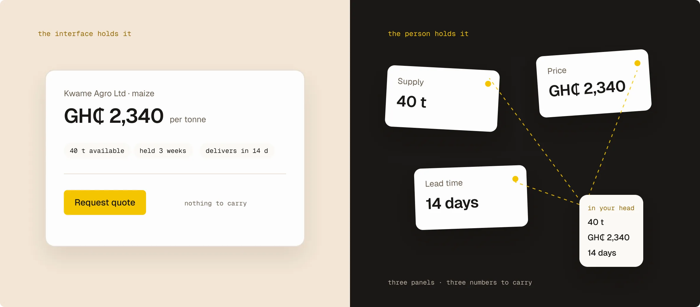
Buyers abandoned it anyway. What they were doing, when you watched them, was arithmetic. Holding a supply figure from one panel while reading a price in another, carrying a lead time across a screen to check it against a delivery window. Every value the interface put somewhere else was a value the buyer had to carry.
That is not a visual problem. It is a question of who is doing the remembering.
What you are holding right now
The fix was mostly reordering. Move each answer to the place its question gets asked, so nothing has to be held in between. Decision time fell by about a third. The same mechanism turns up somewhere unrelated.
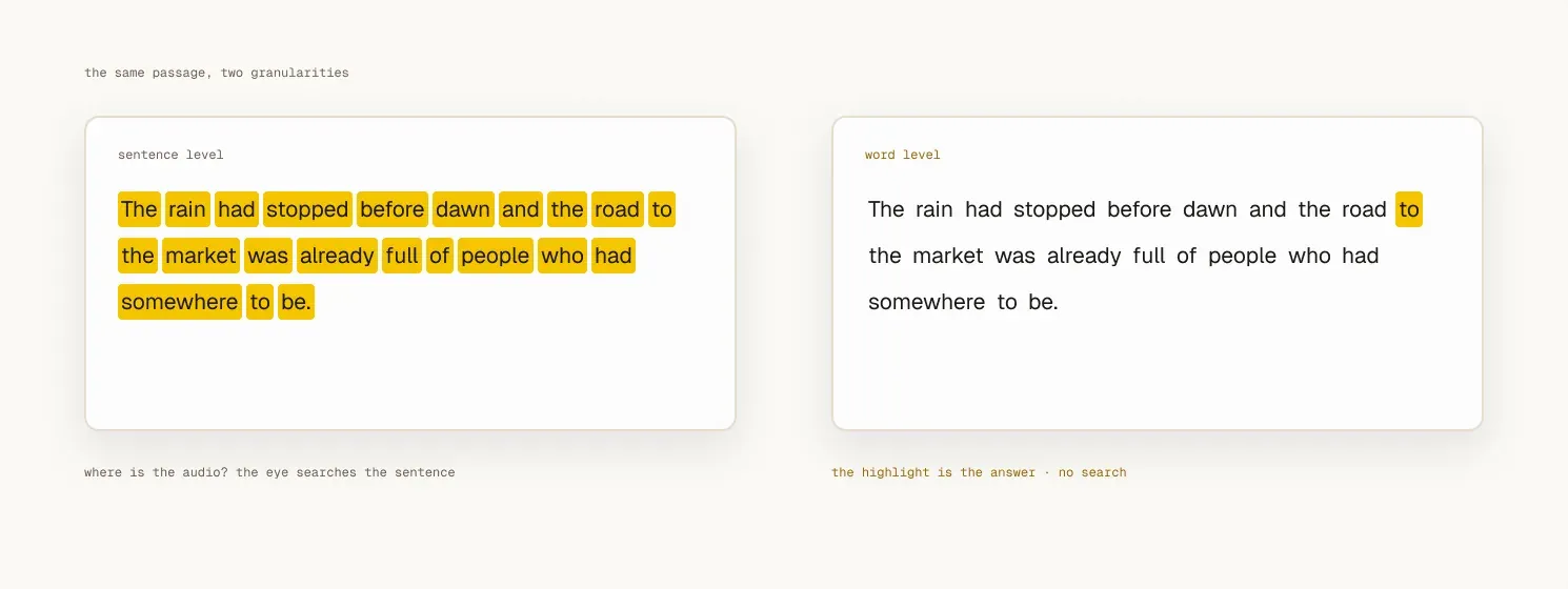
Decoding already costs that reader attention, so anything else the interface asks them to hold comes out of the same budget as comprehension. Word level is not a refinement of sentence level. It is the difference between removing a search and leaving one in place.
Professional tool, accessibility feature, one principle. Whatever the interface does not hold, the person holds, using the attention they needed for the actual task. This kind is measurable. It shows up as hesitation, abandonment, and people asking for things the screen already told them.
What you believe the thing can do
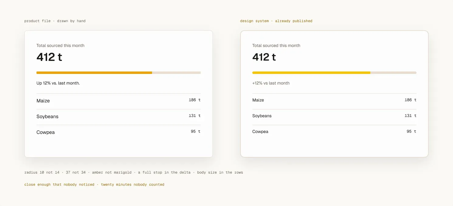
Two designers joined a team I was leading and drifted out of the design system within weeks. One broke the type scale. The other pulled components apart and used the pieces. They were not ignoring the system. The documentation existed and nothing had ever walked them into it, so they were working from an incomplete picture of what was available, and they filled the gaps by building.
That picture decides what a person attempts. It forms early, usually by accident, and it updates far more slowly than the system does.
Why the second one is harder
Working memory load produces evidence. Someone carrying too much hesitates, backtracks, abandons, asks a question the interface already answered.
An incorrect picture of what is possible produces nothing at all. The person does not fail at the thing. They do not attempt the thing. They do it by hand instead, it works, and it costs twenty minutes nobody ever counts.
The first is a layout problem. The second is a problem of what people learned about you before you were paying attention.